How to Mix Pillow Textures Without Making Your Room Look Busy

How Hair Texture Should Influence Your Styling Routine
September 23, 2026
How to Protect Babies From Heat and Humidity During Outdoor Activities
September 24, 2026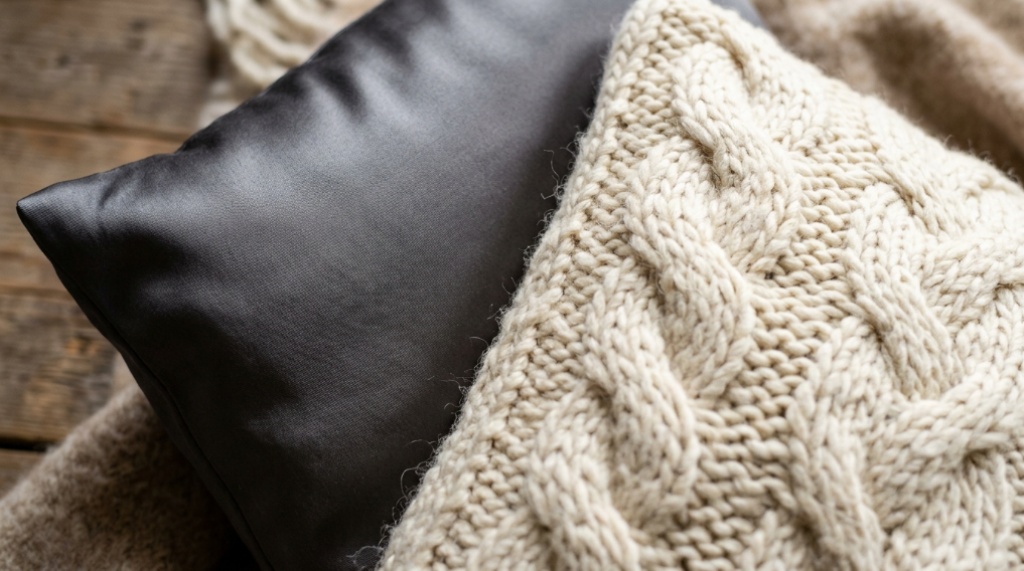
You add a chunky knit pillow, then a linen one, then a velvet accent — and suddenly your once-calm bed looks like a display shelf at a home goods store. Mixing textures is supposed to make a room feel layered and inviting, but without a few guiding rules, it tips straight into visual clutter. The good news: busyness is almost always a contrast or proportion problem, not a texture problem. If you want a reference for how a single strong texture like velvet can anchor a layered look, PeakPillows.com offers a useful starting point. Below, you’ll find a practical system for combining textures so your room reads as curated rather than crowded.
Quick Answer
Mix textures without creating busyness by limiting yourself to two or three dominant textures, keeping one of them visually quiet (linen, cotton, bouclé), and repeating each texture at least twice across the bed. Match or closely relate your colors, then let texture — not pattern or color — create the contrast. Vary pile height, weave, and sheen rather than adding more materials, and keep one smooth or matte element as a visual resting place so the eye has somewhere to settle.
Key Takeaways
- Busyness usually comes from too many competing colors and patterns, not from mixing textures themselves.
- A safe formula is two to three main textures per bed, with one acting as a neutral base.
- Repeating a texture at least twice creates rhythm and prevents a random, cluttered feel.
- Contrast works best when you vary sheen, weave, or pile height — not just material names.
- One smooth or matte texture gives the eye a place to rest and keeps the arrangement calm.
Why Rooms Look Busy in the First Place

Busyness is a perception problem, and it rarely comes from texture alone. The eye gets overwhelmed when it has to process too many competing signals at once: color, pattern, shine, and shape all demanding attention. Texture is only one part of that equation, and it’s usually the least guilty.
A room can hold four or five different textures comfortably if the colors stay within a narrow range and the patterns stay minimal. The reverse is also true — a bed with only two textures can still look chaotic if the colors clash or the patterns fight each other. Before you blame your texture mix, check whether color or pattern is doing the real damage.
The role of color and pattern
Texture is a quiet variable. Color and pattern are loud ones. If you’re trying to fix a busy room, the fastest correction is usually to pull color into a tighter palette and remove patterns, not to strip out textures. Once the loud variables are under control, texture becomes an asset instead of a risk.
How the eye scans a bed
When you look at a made bed, your eye moves from the largest surface (the duvet or coverlet) to the pillows, then to smaller accents. Large, calm surfaces give the eye a place to rest. Small, detailed accents add interest. Problems arise when every surface is demanding attention, or when the accent pillows are so numerous and varied that they become the dominant visual element.
The Two-to-Three Texture Rule
Limit yourself to two or three dominant textures per bed. This is the single most effective rule for preventing busyness, because it caps the number of decisions your eye has to make.
Pick one texture as your base — something with a neutral, quiet surface like washed linen, cotton percale, or a matte weave. That base covers the largest area (duvet, sheets, or coverlet) and sets the tone. Then choose one or two contrasting textures for the pillows and any throw. That’s it.
Choosing a base texture
Your base should be the calmest texture in the room. Linen, cotton, and simple matte weaves work well because they don’t reflect light aggressively and don’t have a lot of surface variation. A base texture should feel almost invisible — it’s there to support the accents, not compete with them.
Choosing accent textures
Accents are where you get to add character. Velvet, bouclé, chunky knit, faux fur, and quilted cotton all bring different surface qualities. Pick accents that differ from the base in a clear, intentional way — usually through sheen, pile, or weave. Two accents that are only subtly different from each other tend to read as a mistake rather than a choice.
Contrast Is Not the Same as Clutter
Contrast and clutter are often confused, but they’re opposites. Contrast gives the eye something to notice; clutter gives the eye too many things to notice at once. A well-mixed pillow arrangement uses contrast deliberately and clutter accidentally.
The clearest way to keep contrast working for you is to change only one variable at a time. If you’re contrasting textures, keep the colors close. If you’re contrasting colors, keep the textures similar. Changing both at once is what tips a room into chaos, Once you have your decorative cushions sorted out, make sure your night-time alignment is just as supported by checking out our guide to the best pillow for back sleepers in 2026.
Vary sheen, not just material
Sheen is one of the most effective contrast tools and one of the most overlooked. A matte linen against a softly luminous velvet creates a clear visual difference without adding any new colors or patterns. You can achieve a similar effect with satin, silk, or sateen against a cotton base.
Vary pile height
Pile height refers to how tall the fibers stand up from the fabric’s surface. Chunky knit and bouclé have high, visible pile. Velvet has a short, dense pile. Linen and cotton are essentially flat. Combining a flat texture with a high-pile one gives you strong contrast with minimal risk of busyness.
Vary weave density
Even within flat fabrics, you can create contrast through weave. A loose, open weave like slubby linen reads very differently from a tight, uniform cotton percale. Mixing the two gives you subtle texture variation without introducing a new material category.
How Many Pillows Is Too Many?
For most beds, five to seven pillows total is the practical ceiling. That includes your sleeping pillows. Beyond that, the arrangement starts to read as decorative excess rather than comfort.
The number matters less than the arrangement. A tight, well-edited group of five pillows will always look calmer than a loose, uneven pile of eight. If you want a rough starting point:
- Twin or full bed: three to five pillows total
- Queen bed: five to seven pillows total
- King bed: six to eight pillows total
These aren’t rigid rules, but they give you a structure to work within. If you find yourself wanting to add more, ask whether you’re adding texture contrast or just adding volume.
How to Layer Textures Step by Step
If you’re starting from scratch or reworking an existing bed, this sequence keeps the process from spiraling into too many decisions.
- Start with the base layer. Choose your sheets and duvet or coverlet in a single, calm texture. Linen or cotton are the safest options because they’re visually quiet.
- Add sleeping pillows in the same texture as the base. This keeps the largest pillow group visually unified and prevents the bed from feeling like it’s competing with itself.
- Introduce one accent texture. Velvet is a common choice because it adds sheen and depth without adding pattern. Place two accent pillows in this texture, ideally in a color close to the base.
- Add a second accent texture if the bed feels flat. A high-pile option like bouclé or chunky knit works well here because it contrasts clearly with the base and the first accent.
- Stop when the arrangement feels balanced. If you’re unsure whether to add more, don’t. The urge to add usually means the existing layers haven’t been arranged properly yet, not that you need another texture.
- Step back and check the color palette. If the bed still looks busy, the problem is almost always color or pattern, not texture.
What to Avoid
Most busy-looking beds share a few specific mistakes. Avoiding these is often more effective than adding more rules.
- Mixing too many sheens. One shiny texture is usually enough. Two or three glossy surfaces competing for attention creates visual noise.
- Using textures that are only slightly different. If two pillows look almost the same but not quite, the eye reads it as an error rather than a choice.
- Adding patterns on top of texture. A patterned velvet pillow against a patterned knit throw is rarely calm. Pick one to be the star.
- Letting accent pillows dominate. If your accent pillows are the largest or most colorful element on the bed, the proportions are off.
- Skipping the base texture. A bed made entirely of accents has nowhere for the eye to rest.
Texture Combinations That Work
Some combinations are reliable because they create clear contrast without competing for the same visual role. The following pairings work well in most color palettes:
| Base Texture | Accent Texture | Why It Works |
|---|---|---|
| Washed linen | Velvet | Matte base against soft sheen creates clear contrast with minimal color risk |
| Cotton percale | Chunky knit | Flat, smooth base against high pile gives strong textural difference |
| Linen | Bouclé | Both are matte, but pile height difference carries the contrast |
| Sateen | Linen | Sheen contrast without introducing pile or pattern |
| Cotton | Faux fur | Dramatic pile and softness contrast; best used sparingly |
These pairings aren’t mandatory, but they show the underlying logic: one texture stays quiet, the other adds contrast through a single dimension.
Adapting the Rules to Different Room Styles
Texture mixing isn’t one-size-fits-all, and the right balance depends on the room’s existing visual weight.
Minimalist rooms
In a minimal room, you have more freedom to add texture because there’s less competing visual information. Two textures can feel sparse; three is often the sweet spot. Lean toward subtle contrast and keep colors tightly coordinated.
Maximalist or eclectic rooms
Rooms that already carry strong color, art, or pattern need more restraint with texture. Stick to two textures and let the existing elements do the talking. A single velvet accent against a plain linen base is often enough.
Small bedrooms
Small rooms benefit from fewer visual breaks. Choose textures that read as related rather than sharply contrasting — for example, linen and cotton rather than linen and faux fur. The goal is calm, not drama.
Frequently Asked Questions
How many different textures can I mix on one bed?
Two to three is the practical limit for most beds. Three works when one texture is a clear base and the other two contrast in distinct ways. Four or more usually requires very tight color control to avoid looking busy.
Can I mix velvet and linen pillows together?
Yes — velvet and linen is one of the most reliable pairings. The matte linen gives the eye a resting place while the velvet adds sheen and depth. Keep the colors close in tone for the calmest result.
Do textured pillows need to match my bedding color?
Not exactly, but keeping them within the same color family prevents clutter. Texture variation reads as intentional when the colors stay coordinated. When both color and texture contrast at once, the room tends to look busy.
Is it better to mix textures or patterns?
For most rooms, mixing textures is the safer choice. Textures add depth without the visual complexity that patterns bring. If you want both, keep patterns small and limited to one element.
Why does my bed still look busy after reducing textures?
The cause is usually color or pattern, not texture. Check whether your pillow colors span too wide a range, or whether any patterned elements are competing. Tightening the palette often solves the problem immediately.
Can I mix more than one high-pile texture?
You can, but it’s risky. Two high-pile textures — like bouclé and chunky knit — can read as competing rather than complementary. Pair one high-pile texture with a flat or smooth one instead.
Conclusion
Mixing pillow textures without creating busyness comes down to restraint and structure. Limit yourself to two or three textures, choose one as a calm base, and let the others contrast on a single dimension — sheen, pile, or weave. Keep colors close and patterns minimal, and stop adding before the arrangement feels crowded. If your bed still reads as busy after those adjustments, the real culprit is almost always color or pattern. Fix those first, and texture becomes one of the easiest ways to make a room feel layered and considered.